Context
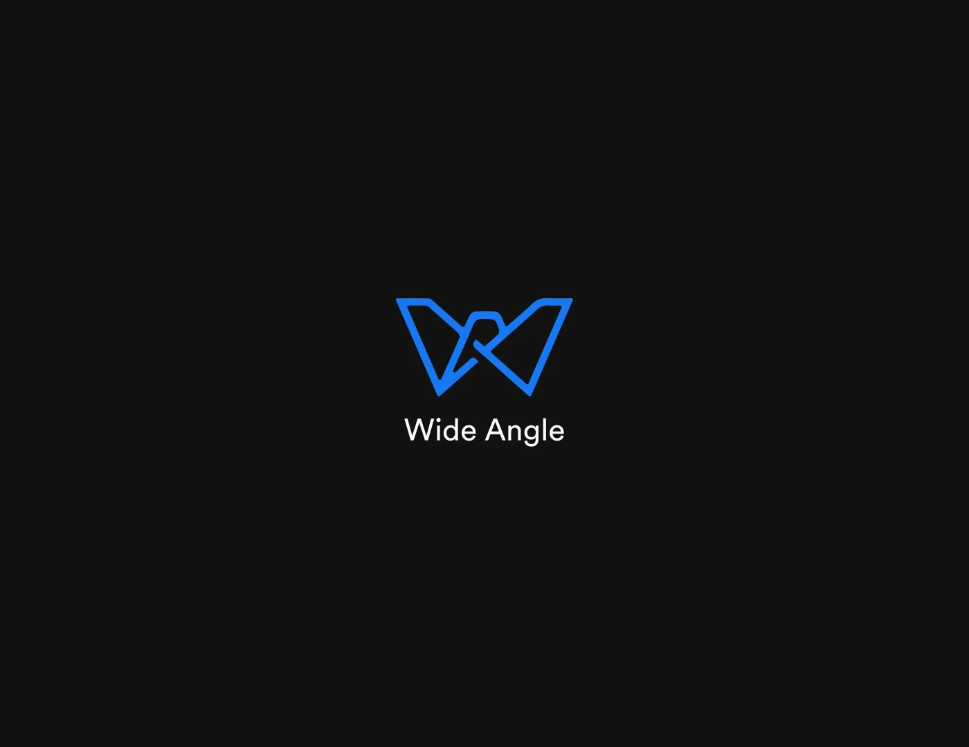
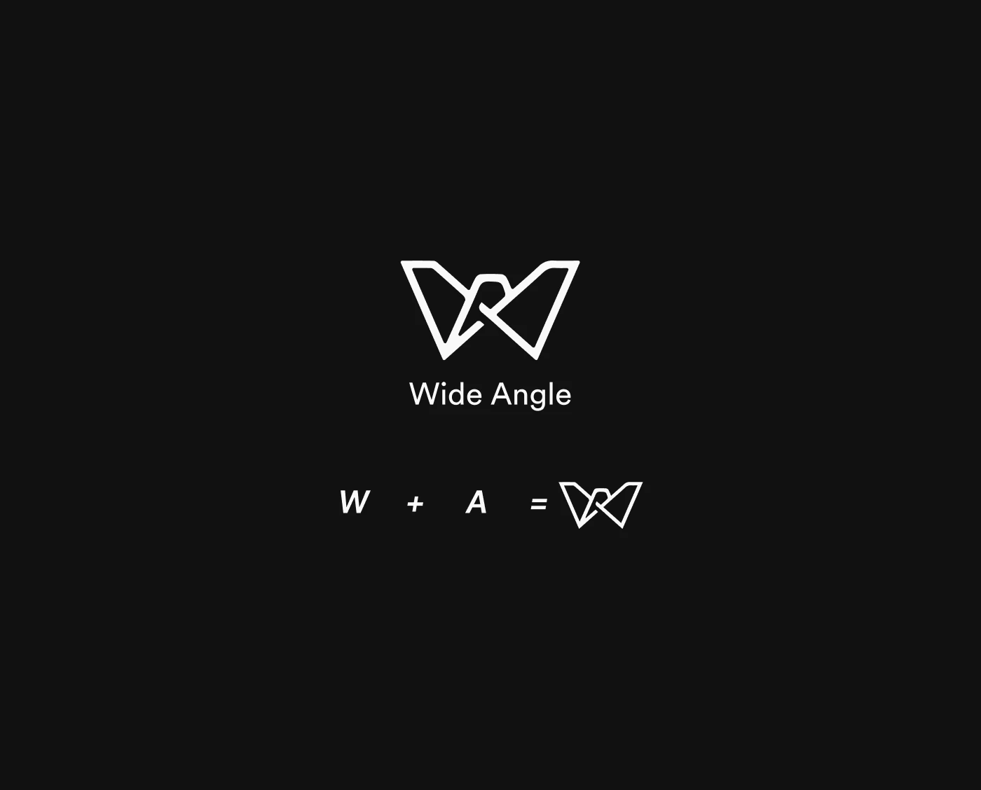
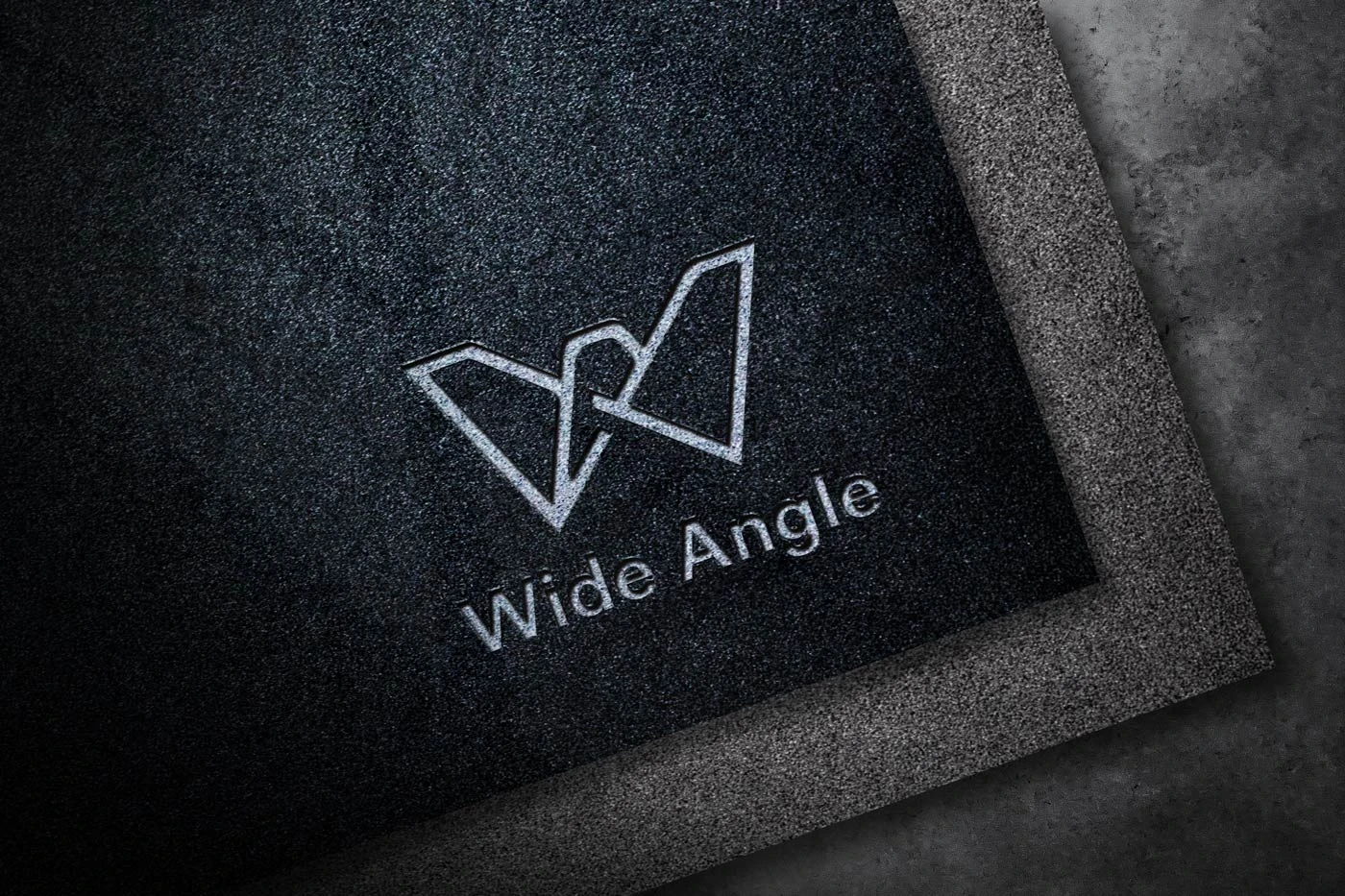
I explored a Wide Angle logo using the letters W and A.
Problem
The brand needed a mark that worked across digital and print, scaled from favicon to billboard, and communicated the 'wide angle' concept without literal imagery.
My contribution
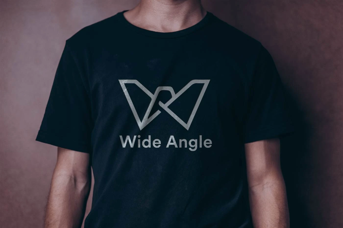
Designed the complete logo system including monochrome, color, and stacked variations. Created usage guidelines.
- Brand Design
- Logo Design
Decisions that shaped the work
- 01
Negative space approach for the 'W' and 'A' integration
- 02
Monochrome-first system for maximum versatility
- 03
Geometric construction for perfect scaling
Process
Explored a compact logo system as a personal exercise, then published the result on Behance.
Evidence
- Logo exploration sheets
- Usage guidelines
- Brand asset package
Outcomes and impact
- Logo system that scales from 16px to billboard size
- Versatile monochrome and color variations
- Clear usage guidelines for consistent application
Reflection
I used the W and A letterforms to explore a compact geometric mark.