I know the brief.
Pick a few strong projects. Make your role clear. Keep the page quiet. Let someone skim it and find your email. I know why this advice exists: hiring teams have other things to do.
I also wanted a place to make things for myself. Somewhere to keep experiments, write, collect what interests me, and try an idea without a client brief. That second ambition got rather comfortable here.
These are useful portfolio conventions, not laws. We broke them knowingly. Here are the medals, including the ones that took far more work than they needed to.
01. Added more than what's recommended!
Rule broken: Show a small, carefully edited selection of your best work.
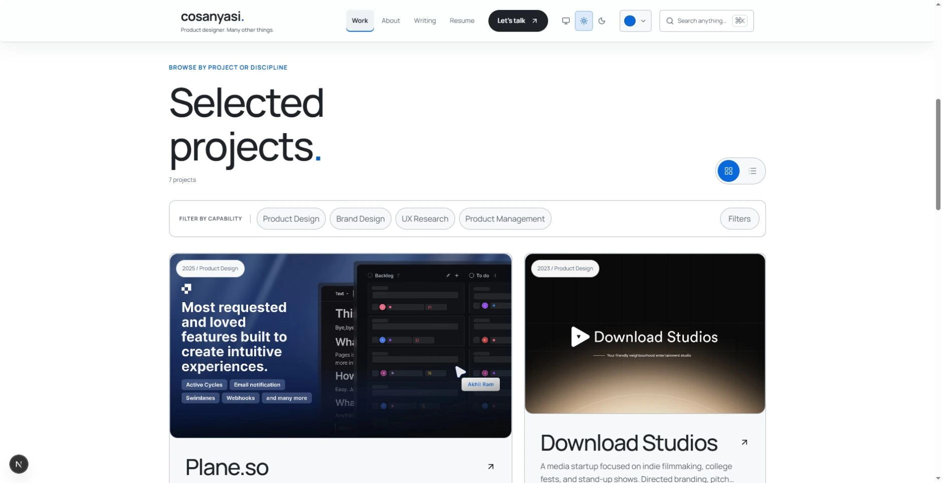
Three to five strong projects would make a tidy portfolio. The homepage has five. The work archive now brings case studies, products, and experiments into one place, with six featured items to start from.
I kept the range on purpose. A caregiver tool, an enterprise workflow, and a game do not tell the same story. Someone looking for a particular kind of work can find it here.
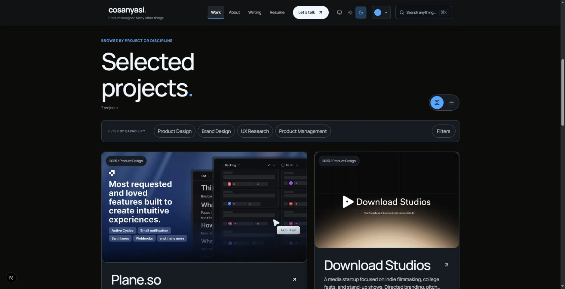
The earlier archive had capability chips and advanced filters. The unified Work page keeps grid and list views, with search and categories for case studies, projects, experiments, and branding. Yes, I know a short list would have survived without a browsing system. Building that system was part of the fun.
02. I like to brag and Brag I did.
Rule broken: Get to the work quickly and keep the homepage easy to skim.
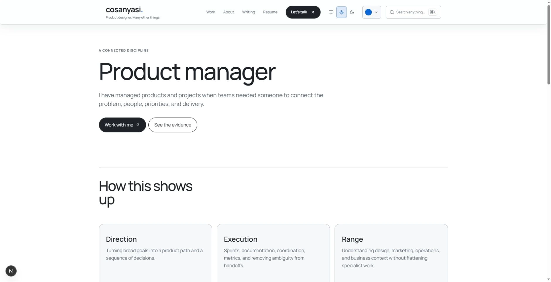
I know the efficient opening: job title, one sentence, selected work. Mine has a greeting, personal objects, a status row, and an introduction before the projects. Keep scrolling and there are capabilities, career history, testimonials, interests, writing, and another invitation to talk.
Some of that could live only on About. I kept it on the homepage because I want the work and the person who made it to share an address. You can take the Work shortcut. The longer route is there for anyone who wants to wander.
03. Why pick one ? When you can vibe five.
Rule broken: Choose a coherent visual style and stick to it.
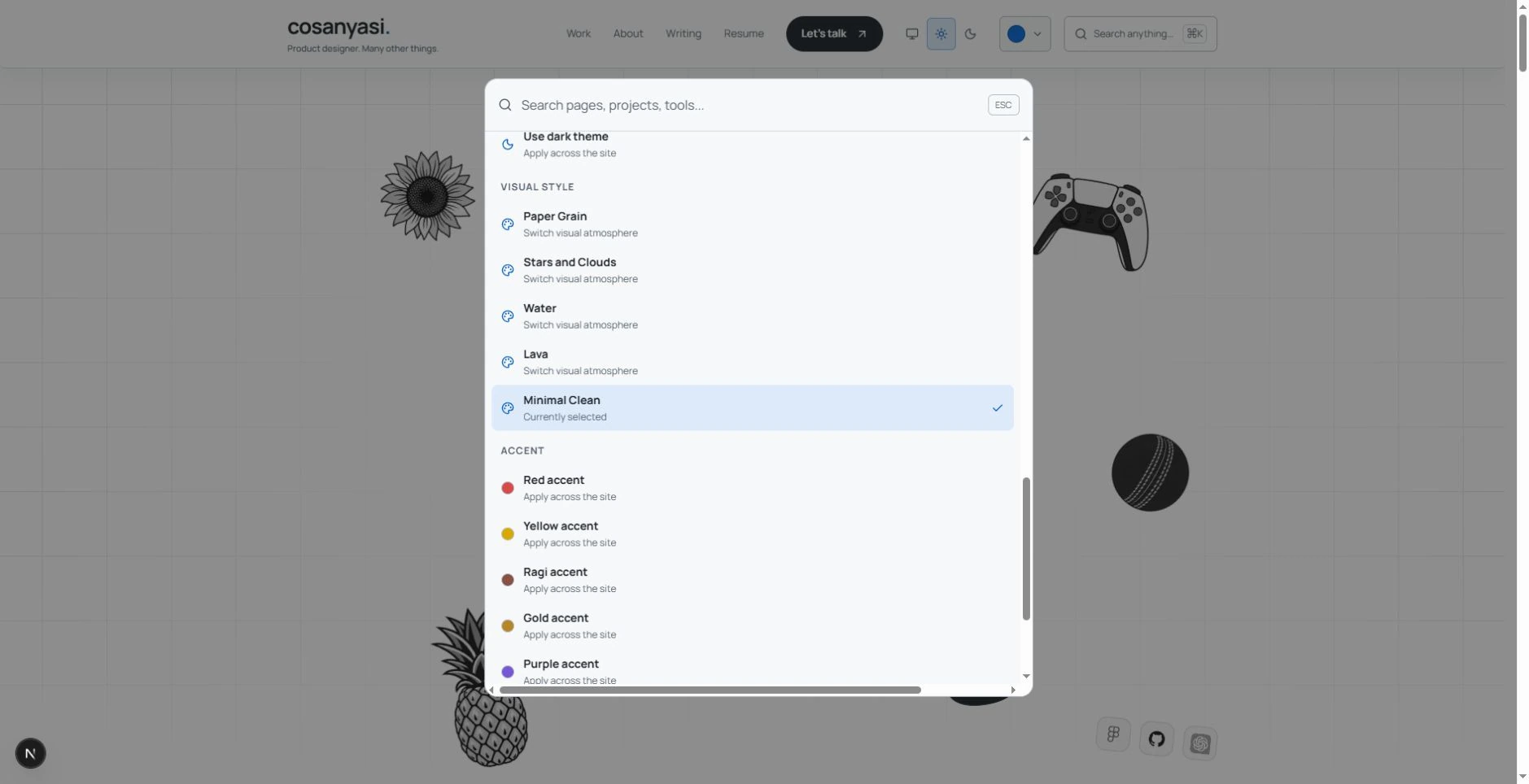
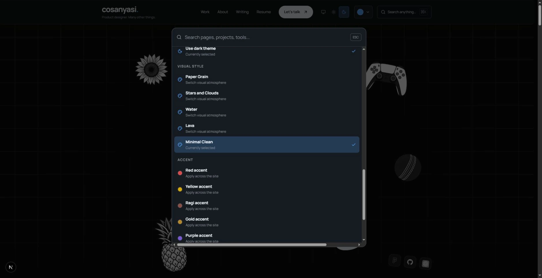
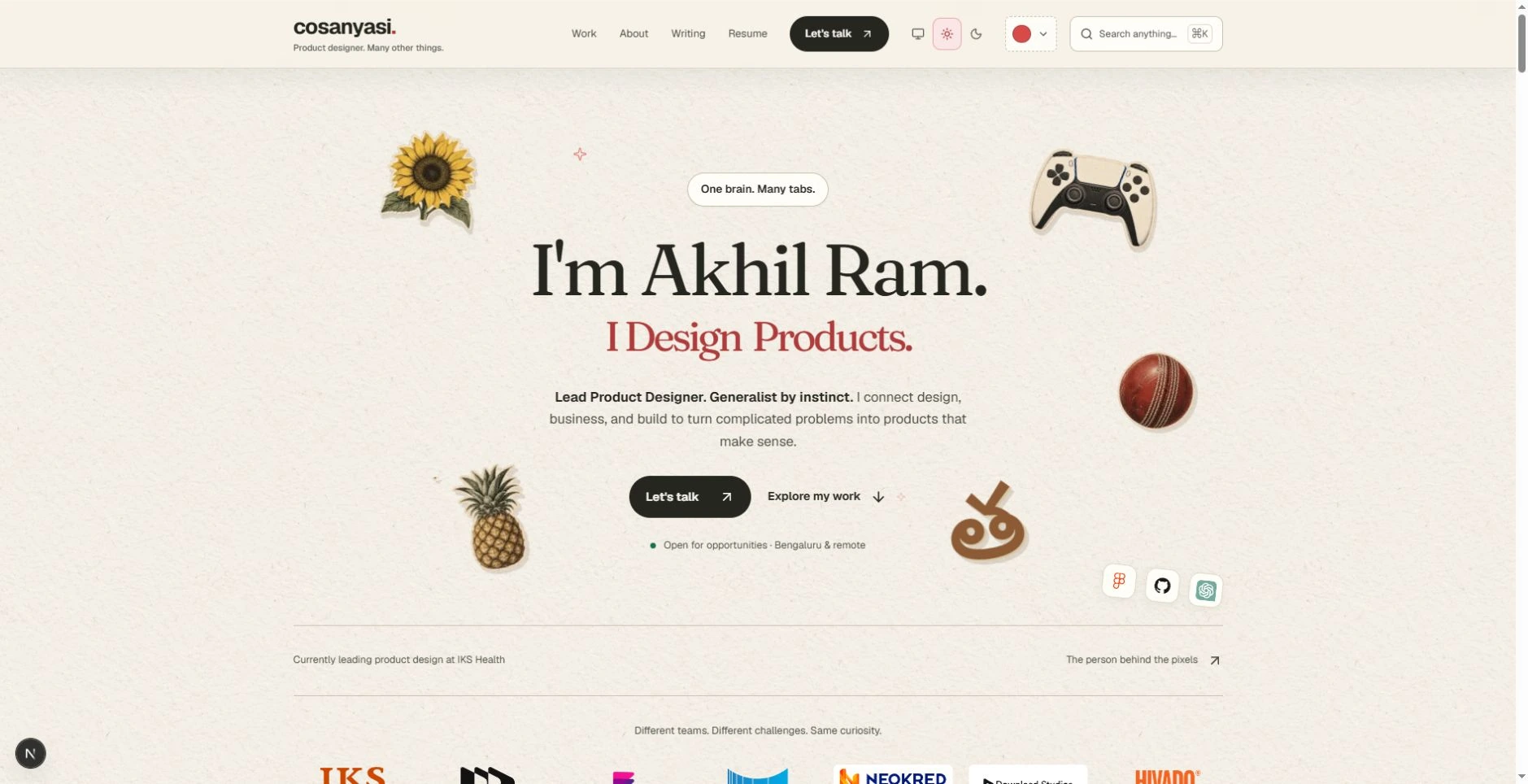
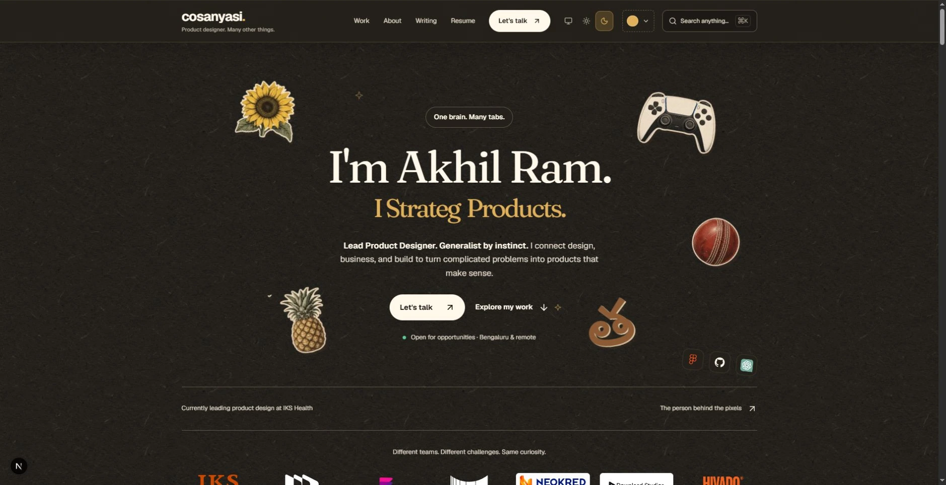
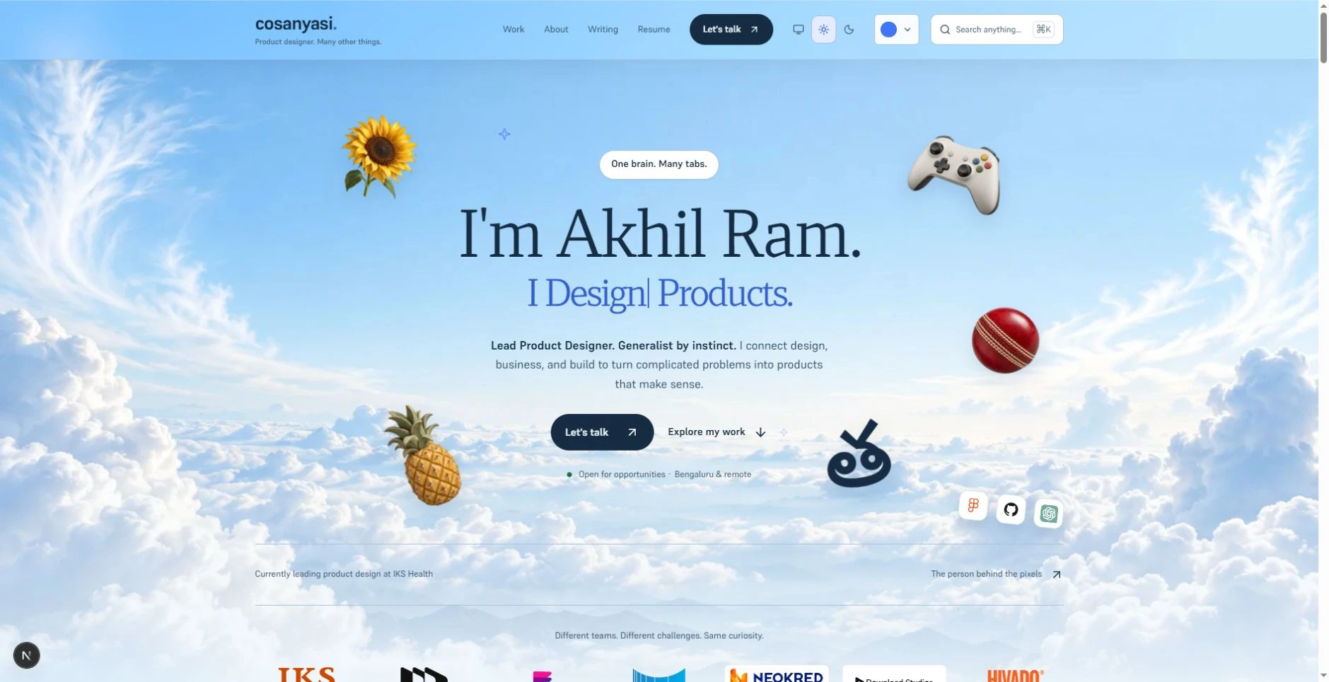
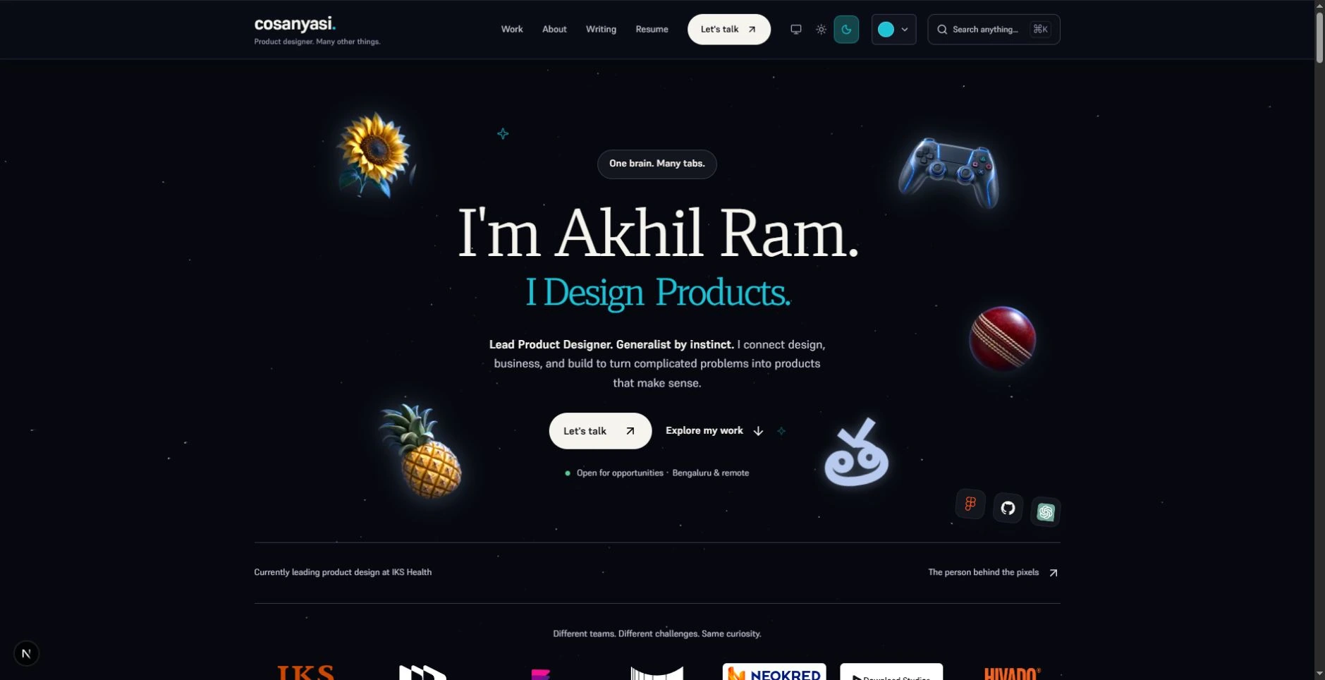
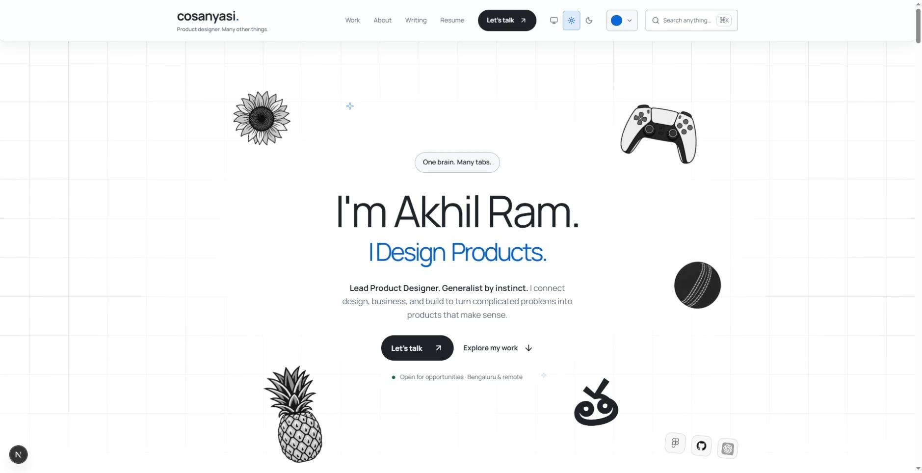
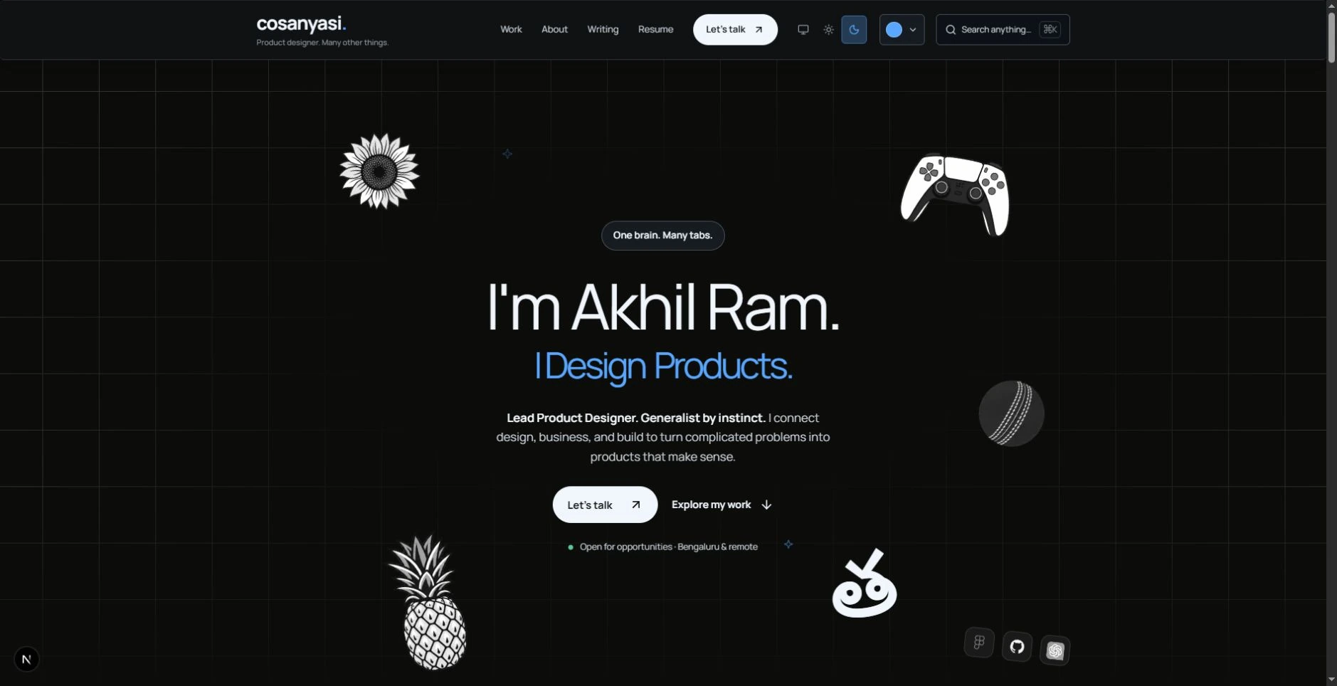
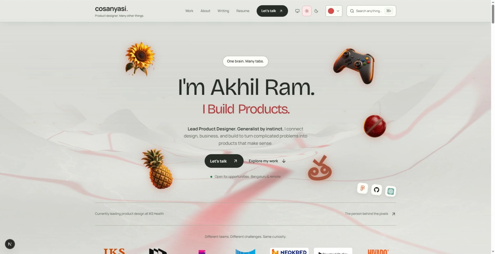
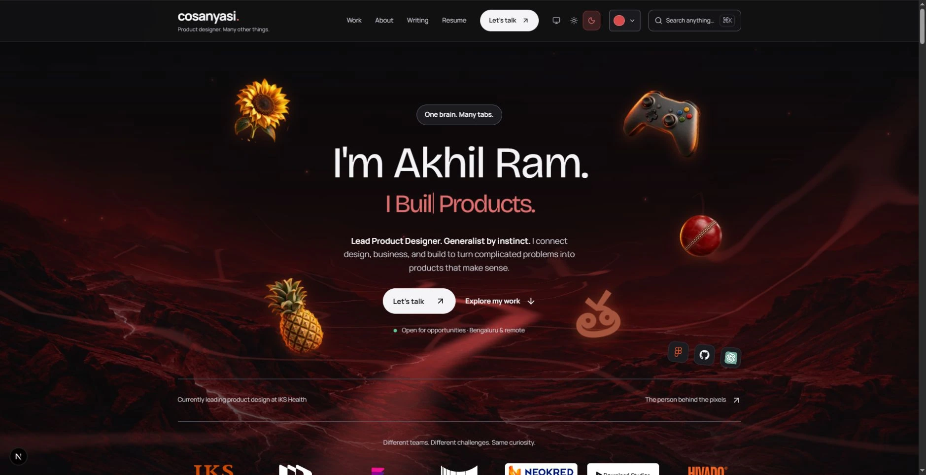
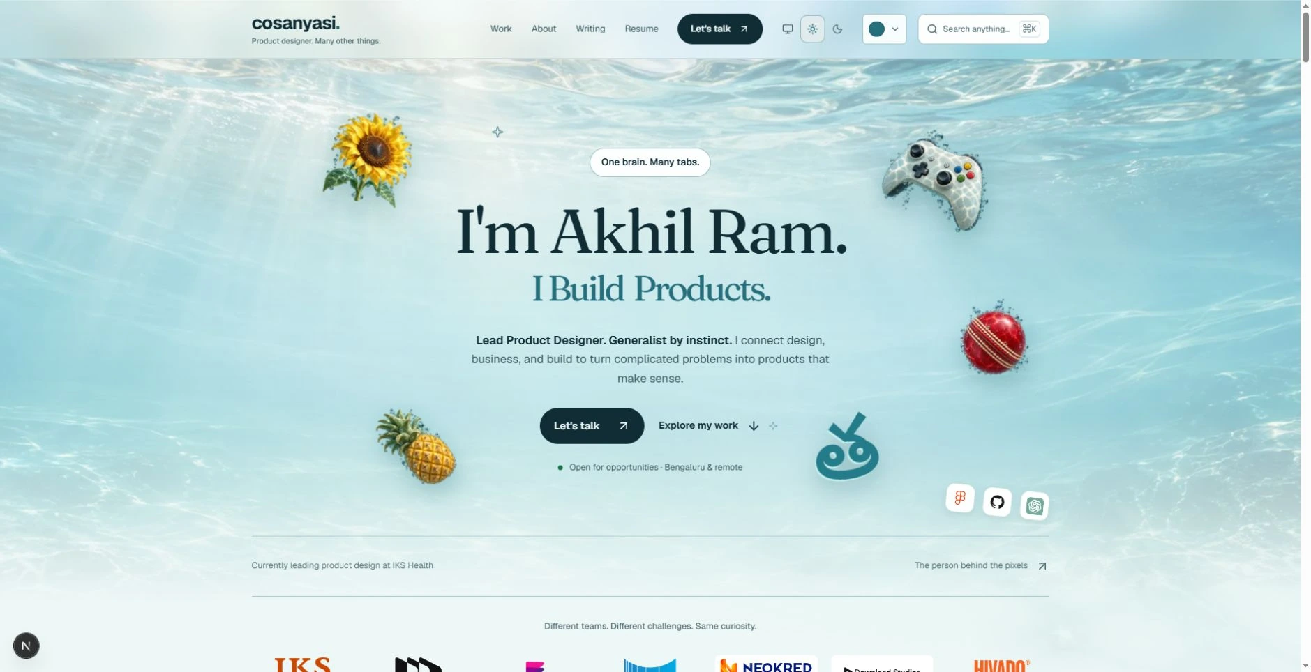
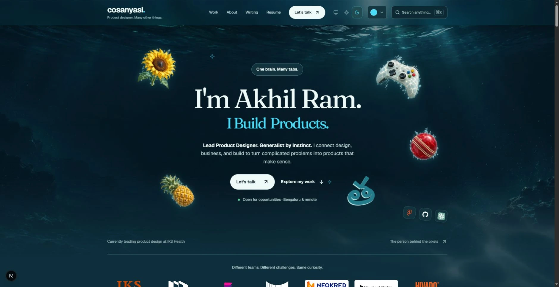
Consistency helps people recognise a designer. pff... I know. I still built Paper Grain, Stars + Clouds, Minimal Clean, Lava, and Water. They change the atmosphere and typography around the same content. I wanted to see how far can I goof around and see how site could move without having to rewriting who I am.
To try them, press Cmd + K on a Mac or Ctrl + K on Windows. In the command menu, scroll to Visual style and choose one. Press Esc to close the menu. You can also scroll to the footer and open its Visual style picker. On a phone, use the search button or the footer picker.
04. Why pick my favourite, when you can pick yours?
Rule broken: Keep a restrained, recognisable color palette.
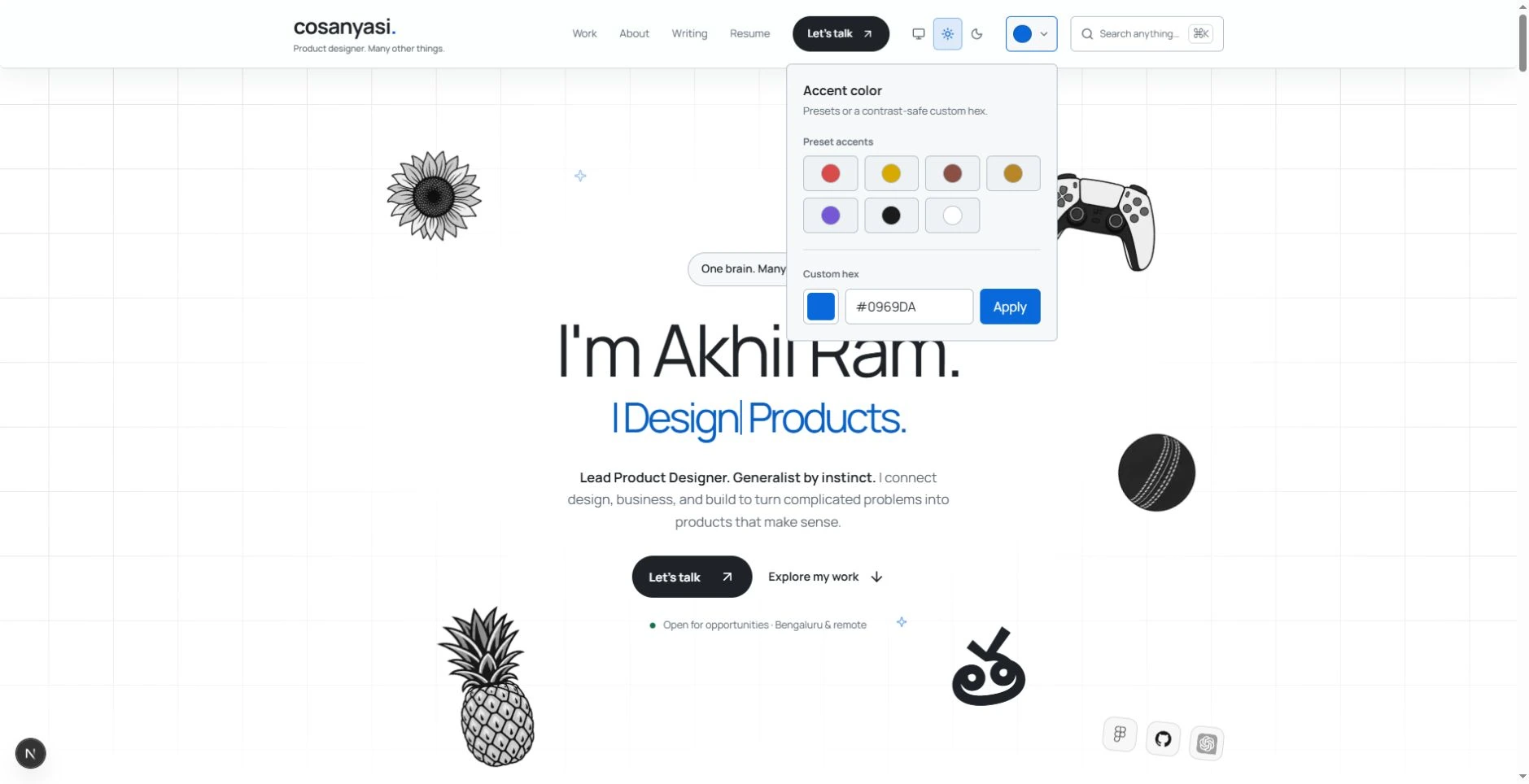
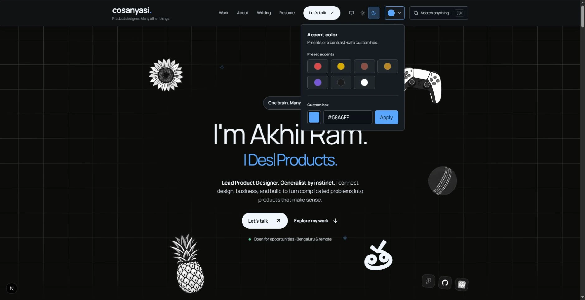
A fixed accent would have been easier to design around. We shipped seven presets: Red, Yellow, Ragi, Gold, Purple, Black, and White. Then we added a custom accent picker, because seven clearly left too much undecided.
Click the colored swatch in the top navigation, or the Accent control in the footer. Choose a preset, or enter a color in Custom hex and click Apply. The command menu has the preset accents too. Style, light/dark theme, and accent are separate controls. Choosing Lava starts with Red; you can change its accent afterwards.
I wanted the site to respond to whoever is visiting. You can leave it purple. You can spend longer choosing a shade than reading my résumé. We made room for both.
05. The scenery does not need a business case.
Rule broken: Let the work carry the page; keep decoration and motion restrained.
I know a minimal design would leave fewer things competing for attention. I kept the actual Origin Kit effects: stars for Stars, grids for Minimal, paper grain for Paper, terrain for Lava, and flowing water for Water. Those choices were made to depict the five elements in my own way, paper was earth and everything else is either obvious or my wish, by now i think it's evident.
The tea, controller, sunflower, changing hero text, and moving landscape near the final invitation are extra too. None of those are needed to open a case study. I kept them because making a place feel like mine was part of making the site.
06. Nobody requested an interests encyclopedia.
Rule broken: Include only what helps someone assess you for the job.
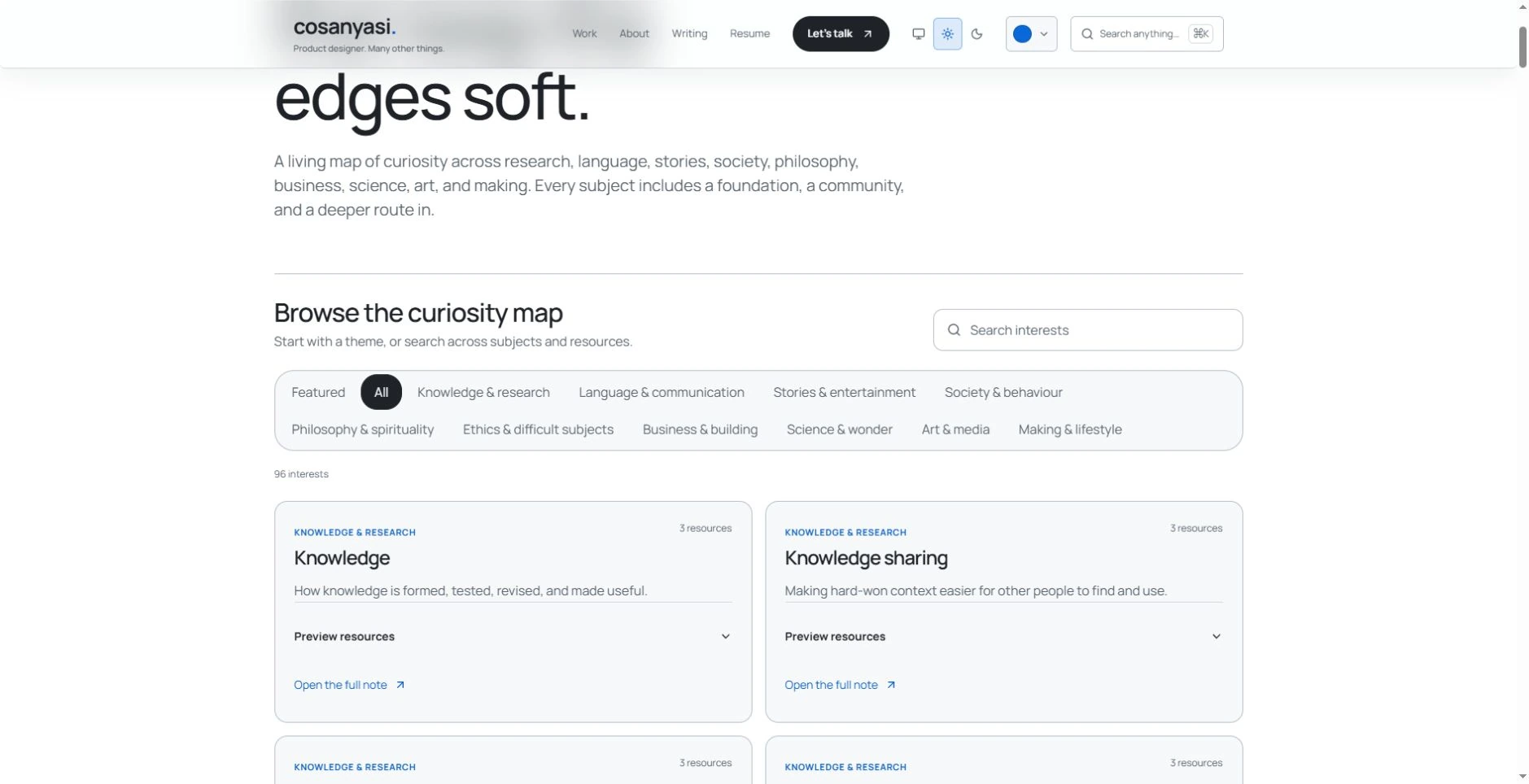
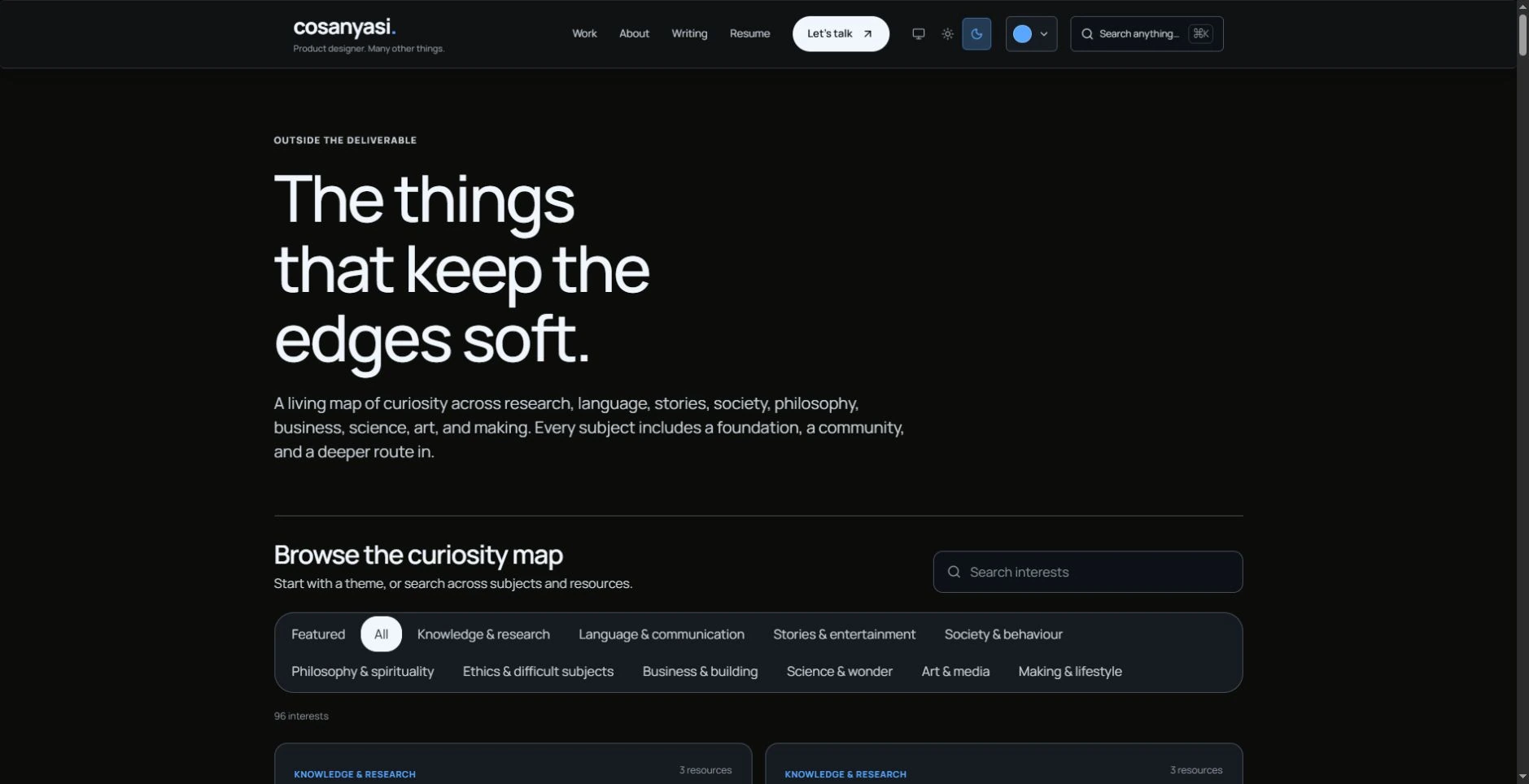
One line about hobbies would do the job, but I had to overdo it with a dedicated page and 97 subjects which I am still building and writing about. with search filters and individual pages.
I know a recruiter may never need my reading route into philosophy or astronomy. I built it anyway. The things I keep returning to belong here, and someone who shares an interest might find a useful link. It is allowed to be useful to someone other than the next hiring manager.
07. The tool I use asked for a room they deserve.
Rule broken: Show what you achieved, rather than making software names the story.
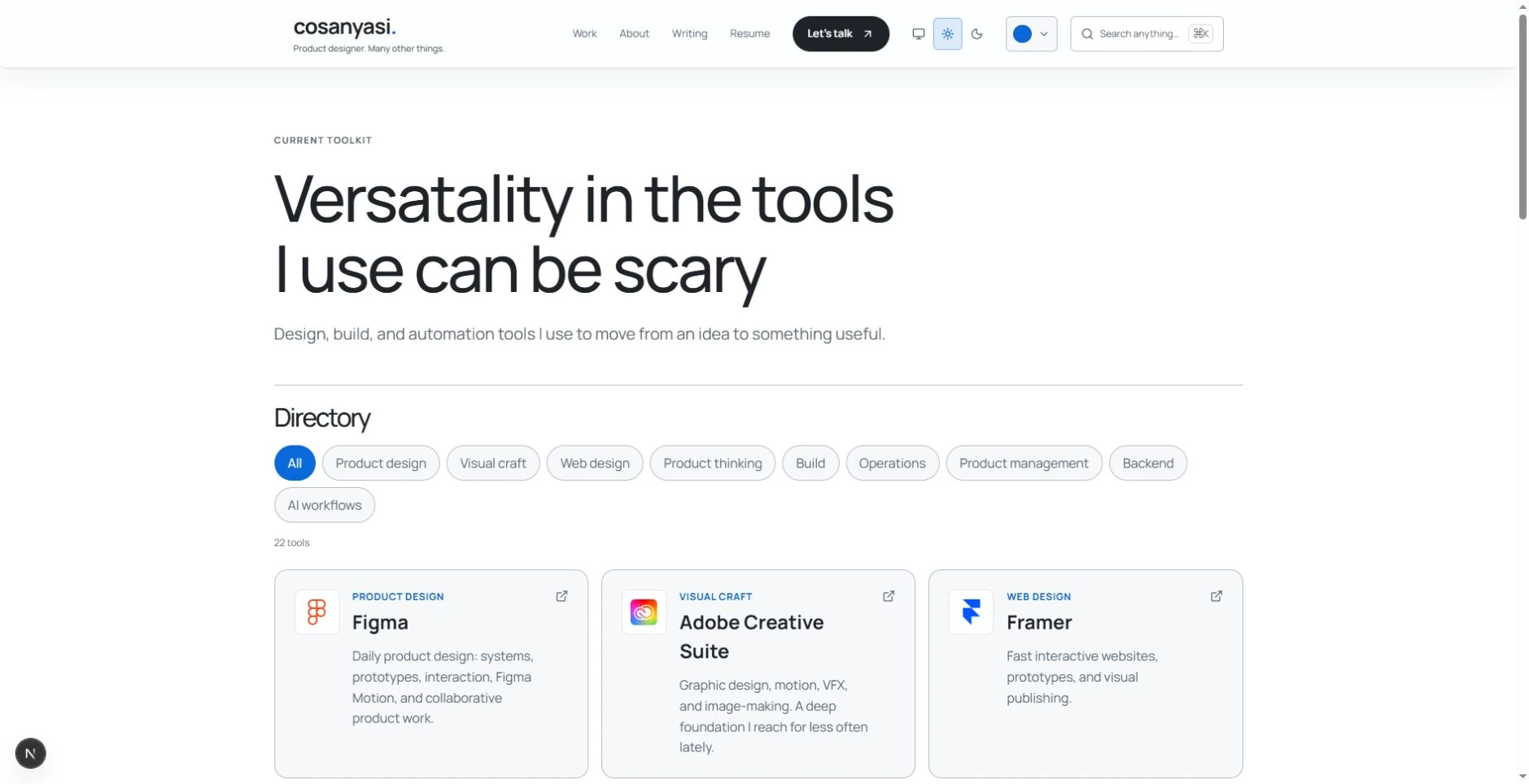
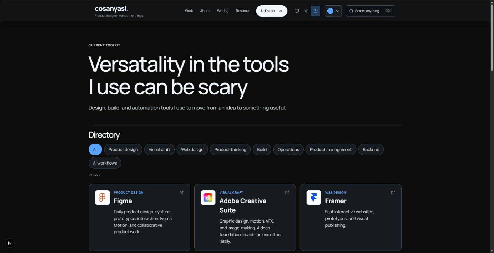
Knowing a tool is not the same as solving a problem. I know that. There are still 22 tools here, organised into a browseable directory, as well as tools in the homepage and case studies.
I kept the directory for the practical question of what I work with and what I use it for. It also became a shelf for useful software. The case studies carry the decisions; the tools get a room of their own. An extravagant amount of floor space for a stack list.
08. Cosanyasi refused to fit inside one job title.
Rule broken: Make one clear pitch for the role you want.
A single target role makes a faster hiring decision. This site has pages for product design, product management, prompt engineering, and startup building. The homepage approach section goes further, with five role perspectives.
I know that breadth asks someone to do more sorting. I kept it because these are parts of how I work, and I do not want to rewrite my interests every time a job description changes. The person stays the same. The way into the conversation can change.

09. You probably didn't know you can play with it.
Rule broken: Explain your process clearly without making the reader operate it.
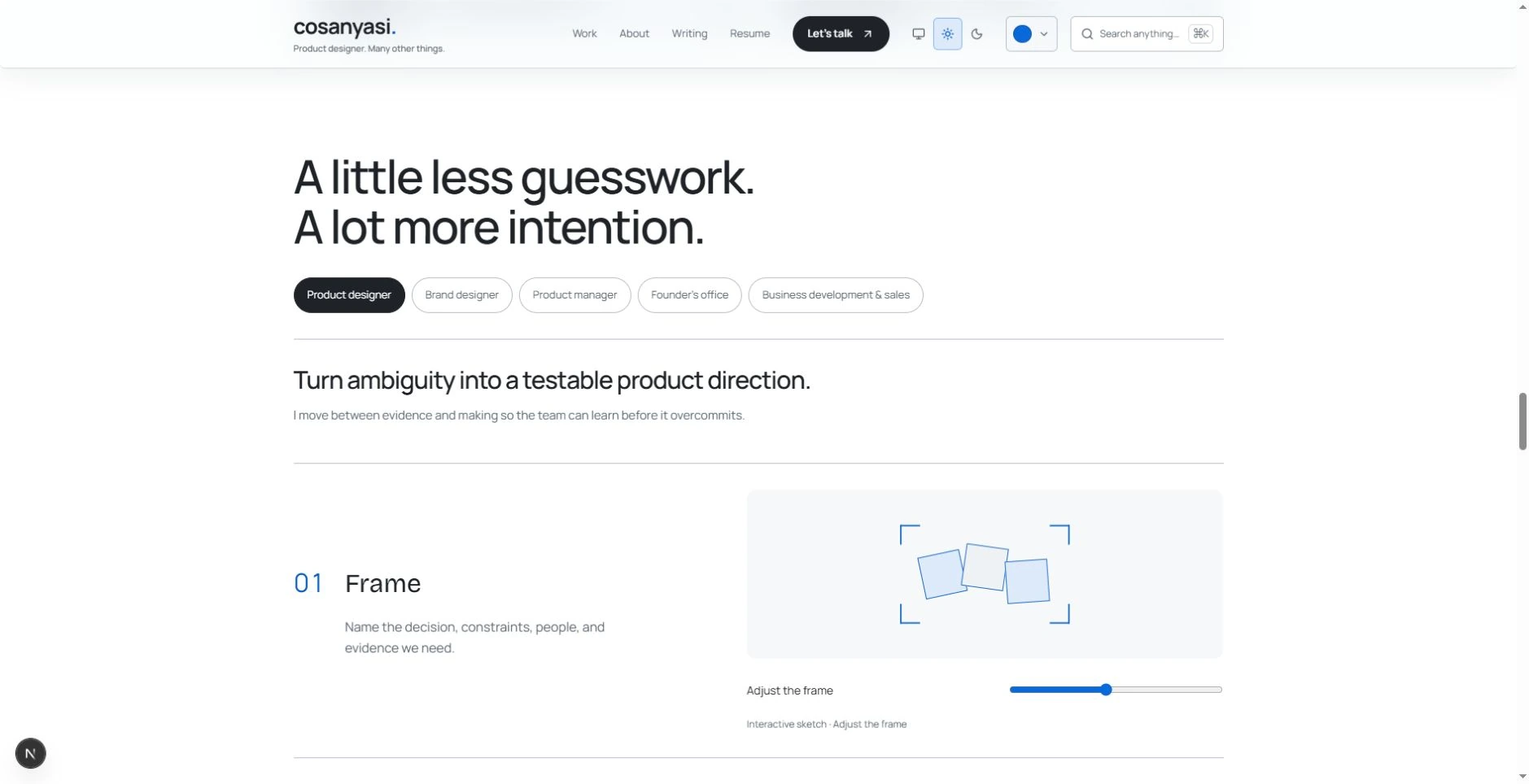
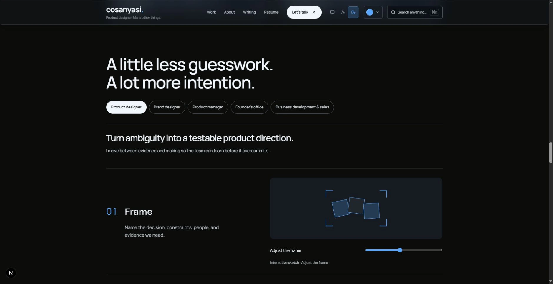
I could have written a few lines about framing problems, checking evidence, and testing assumptions. We built role tabs, an interactive frame, controls to compare directions, and a way to reset the whole thing.
You can switch perspectives and try the controls on the homepage approach section. I know this is more effort than reading a paragraph. I wanted to make the explanation tangible, and I enjoyed building a small interaction that was not another carousel of process icons.
10. Why-hire-me? 3 Reasons Why!? 13 would be too much now wouldn't it?
Rule broken: Give people one clear hiring story and one obvious next step.
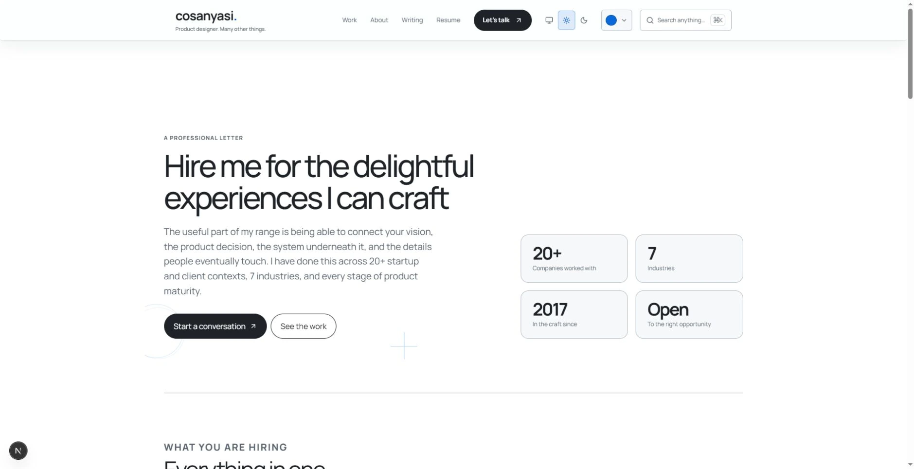
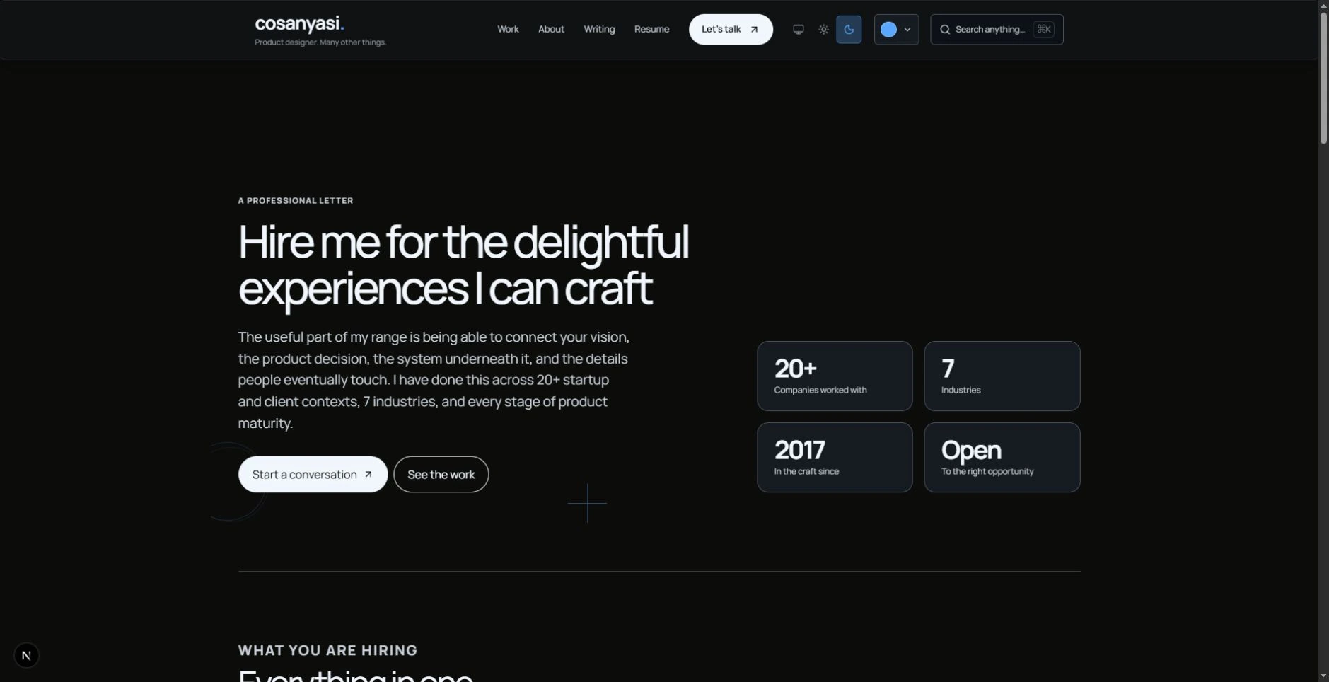
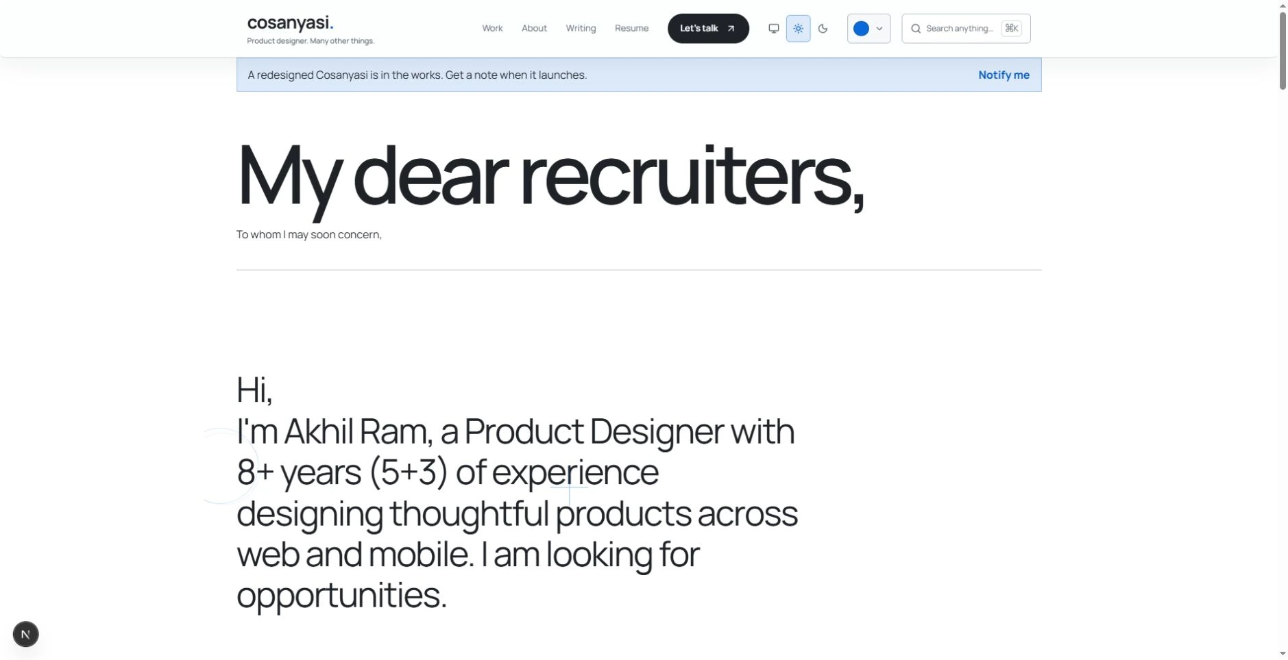
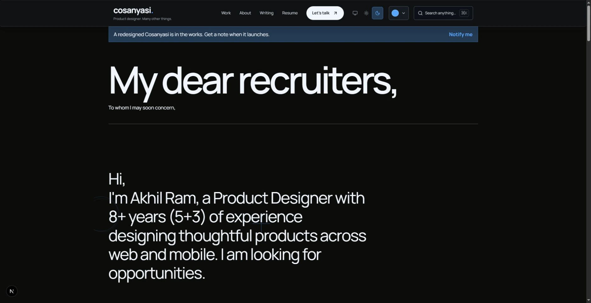
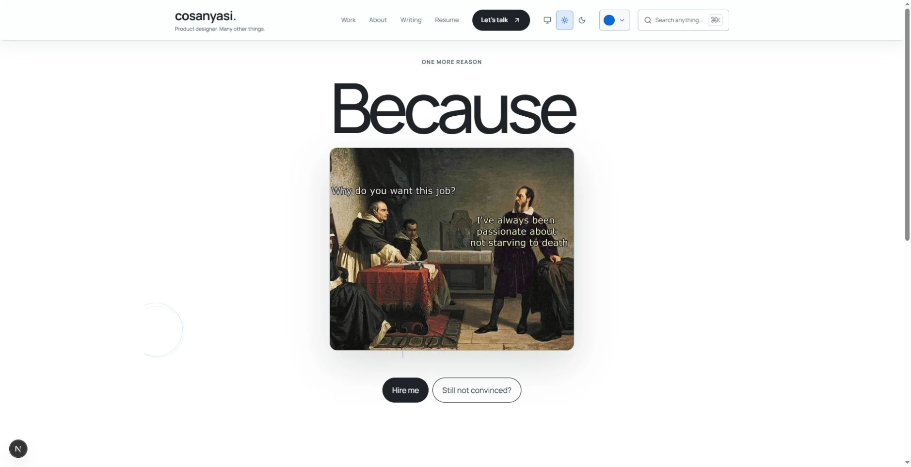
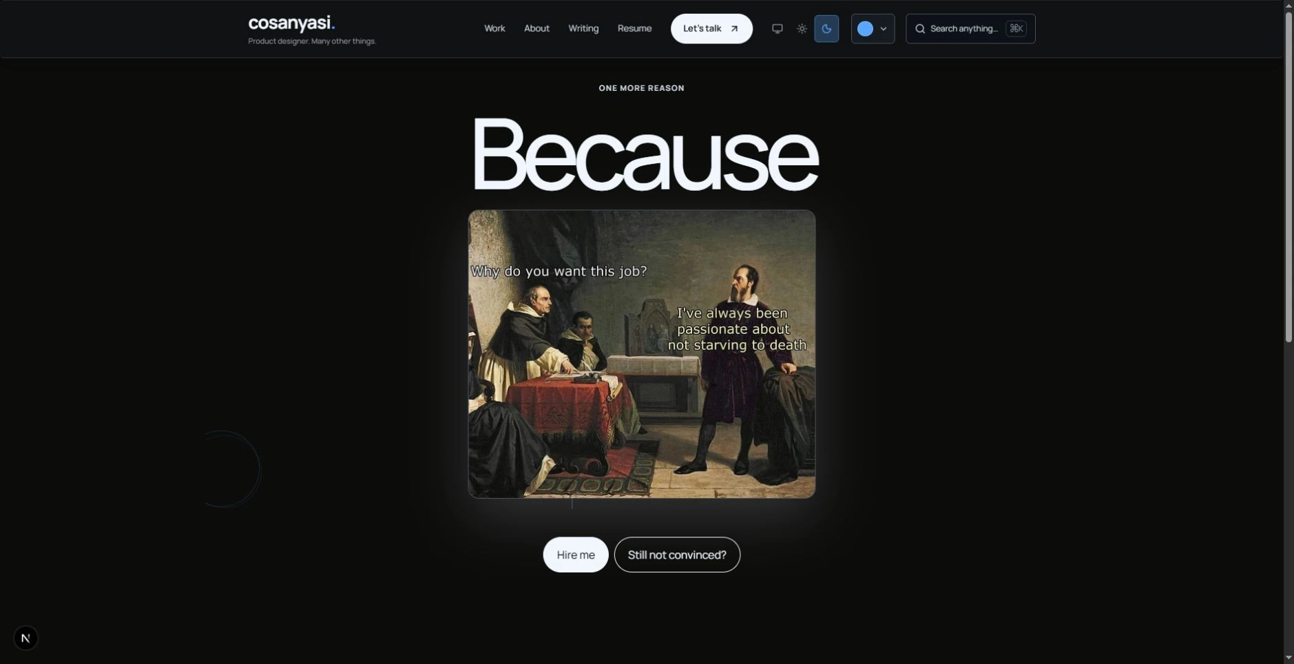
There is the direct pitch, a letter to recruiters, and a short visual version. Same person. Same basic request. Three deliveries.
I know one edited version would be neater. I kept the alternatives because I like writing as much as arranging a screen. The letter gets to be a letter. The visual version gets to be brief. They are different attempts worth keeping, not evidence that asking three times improves my odds.
The short version even has a Still not convinced? detour with hypnotic rings and another invitation. I know when to stop asking. Here, I kept the joke going.
11. The portfolio has someone you can ask questions.
Rule broken: Put the important answers where people can read them directly.
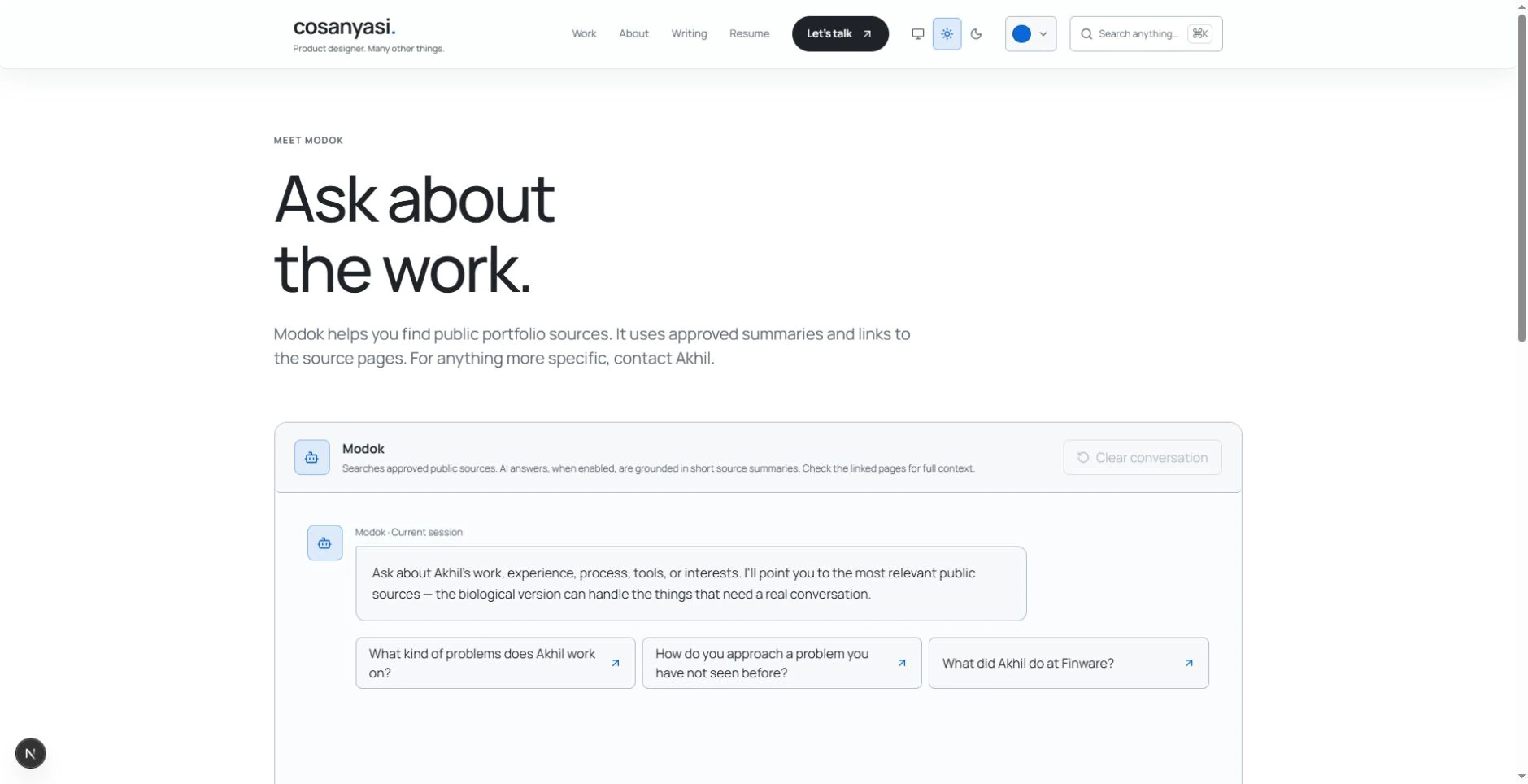
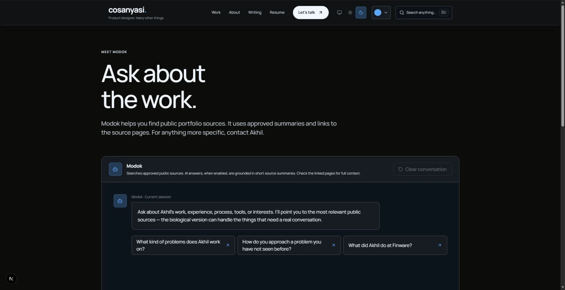
A work page, an About page, and a contact link could answer most questions. We also built Modok, a chat interface with suggested questions, alongside interview notes.
I know you should not have to interview a website to find my experience. The ordinary pages are still there. Modok exists because I wanted to build a conversational route through the material and see what that route felt like. Optional curiosity, given a whole interface.
12. We built navigation for a small town.
Rule broken: Keep the structure shallow and the navigation simple.
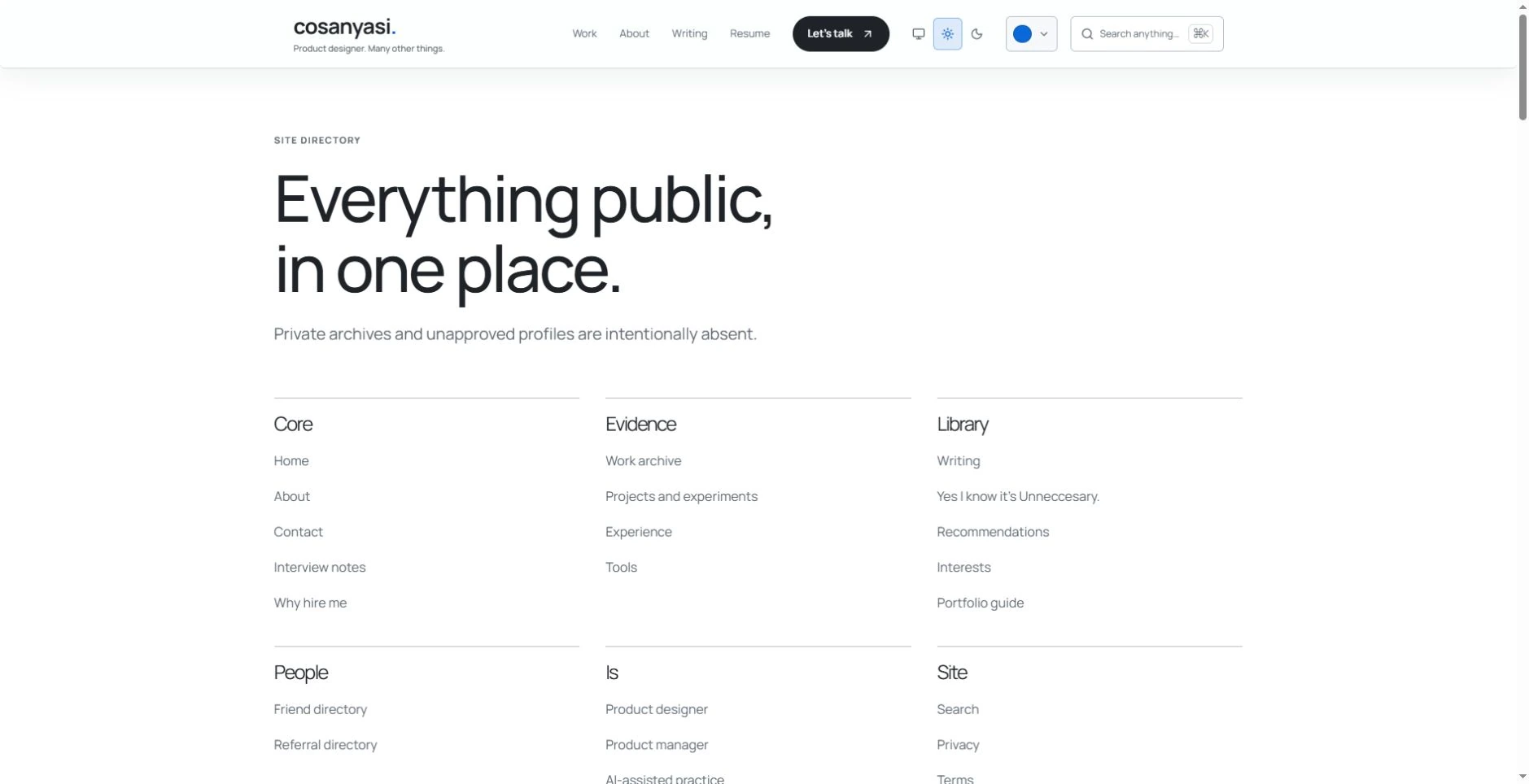
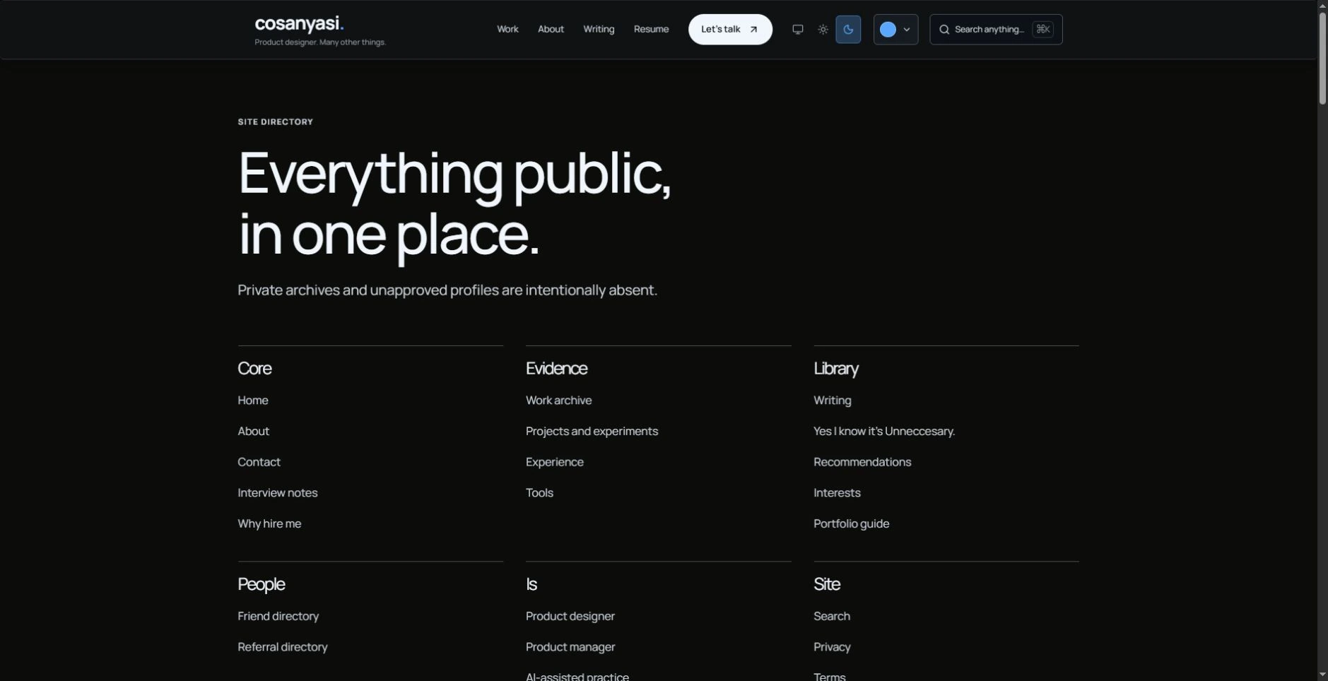
Work, About, Contact. That could have been the entire map. Here, the footer has a directory, the sitemap has grouped routes, and Cmd + K / Ctrl + K opens search, recent searches, appearance commands, and a Surprise me option.
I know search is an unusual response to the question “how many pages does your portfolio need?” We chose to keep the pages, then gave them more ways to be found. Search is useful if you know what you want. Surprise me is for the opposite afternoon.
13. Two Resumes, No Lies!
Rule broken: Make the right version easy to find without making recruiters choose.
The Resume you can download in the navigation is my hybrid, AI-first positioning. The Master resume in the footer is the fuller Product Designer version, with the complete story behind the work.
You could ask: if you want to show two, why not add a dropdown to the navigation? It sounds tidy, but it would immediately make recruiters wonder which one they are meant to read. That small decision delays the moment they reach the resume. Putting them in two deliberate places is a little gamble: I can track which one gets more clicks and promote the resume that helps me most.
14. I left the rest of my life in the room.
Rule broken: Keep a professional portfolio focused on professional evidence.
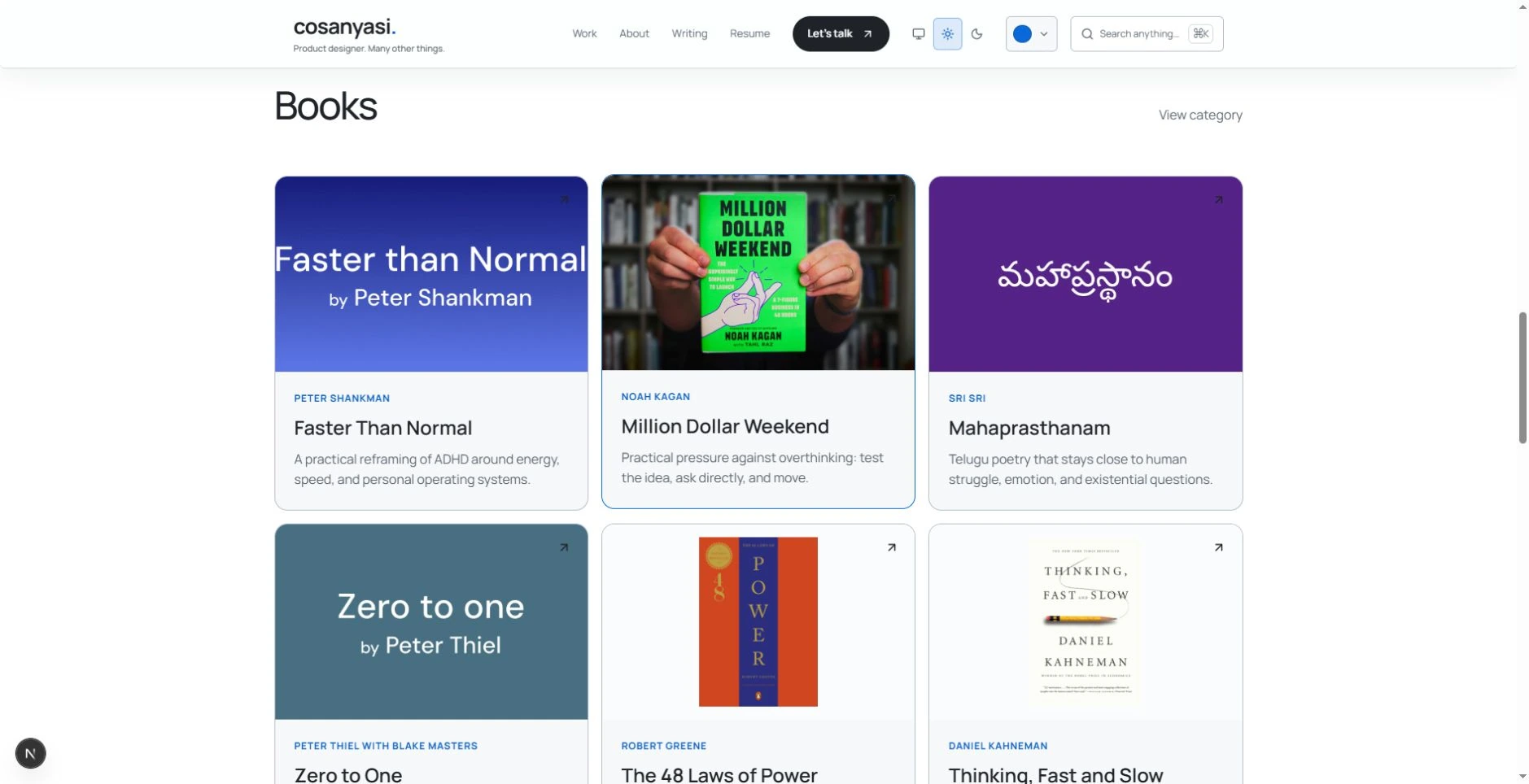
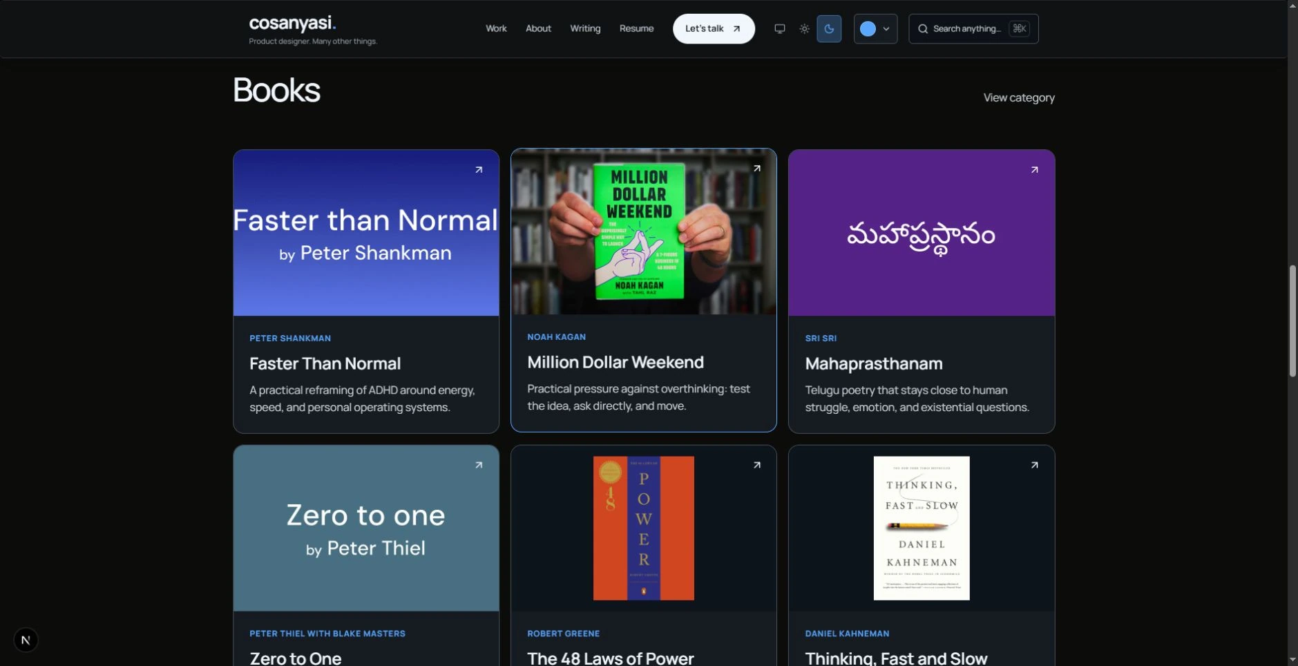
I know a book recommendation is not proof that I can design your product. There are still 19 recommendations across music, books, and people. Some links take you straight out of the site. I am happy to send you toward something worth your time.
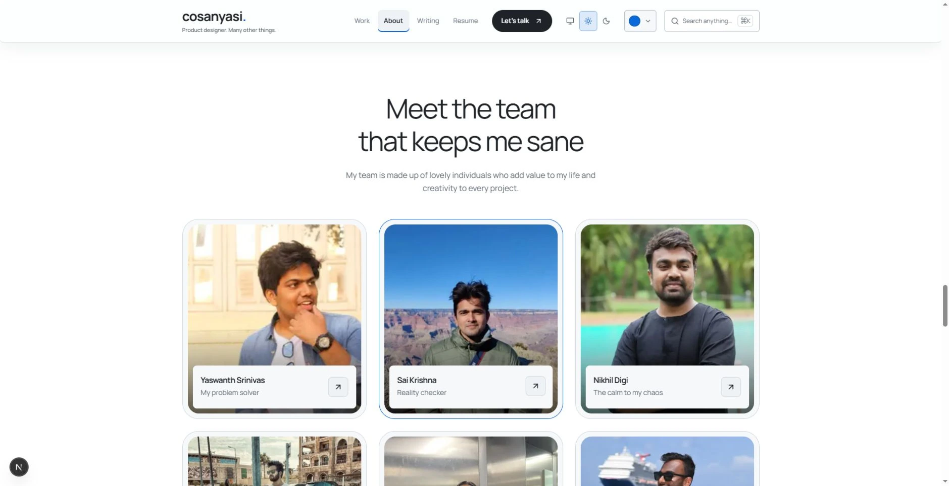
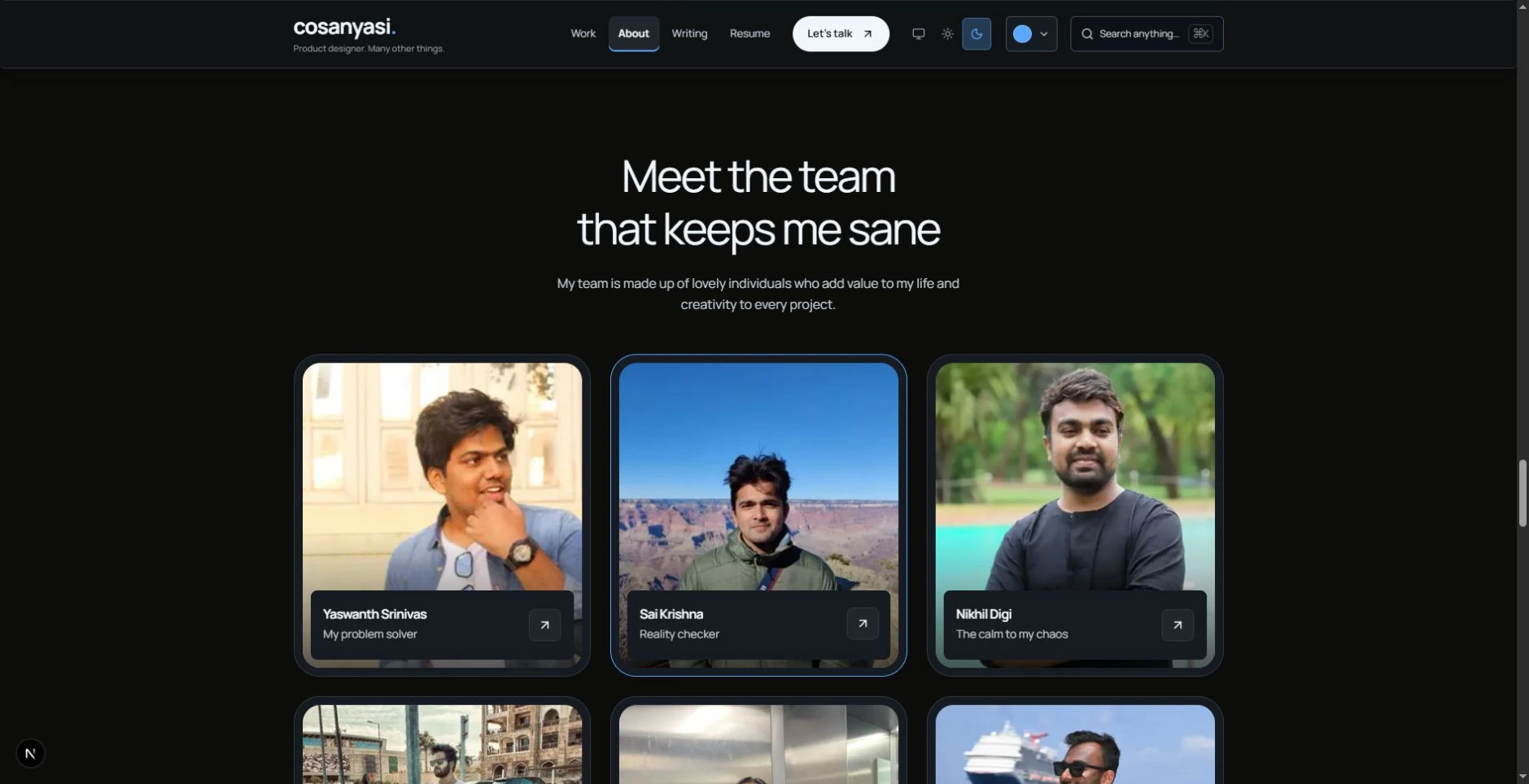
About also introduces the friends who keep me sane. A personal endorsement sits beside professional ones on the homepage. I kept these parts because a portfolio with all the person removed would be a strange introduction to working with me. You can assess the projects and also learn who brings the tea.
14. A couple of empty rooms are open.
Rule broken: Publish finished content and leave planned pages off the menu.
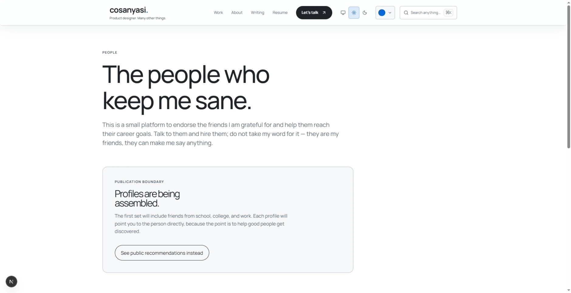
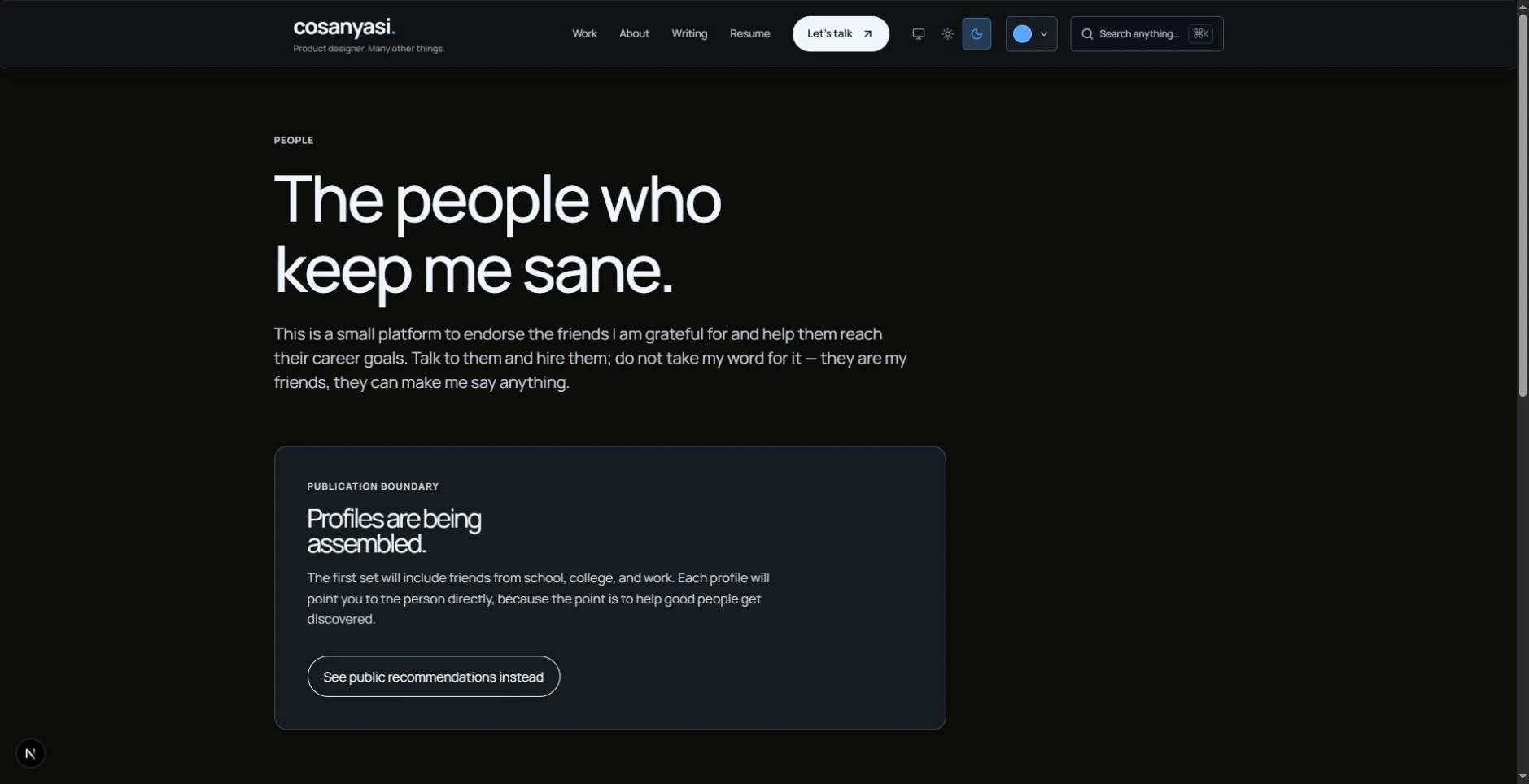
The friends directory says the profiles are being assembled. The referral page says it is launching soon. I know those are two clicks that do not lead to a full shelf yet.
I left them visible because this place is still being built, and I want the intention to be visible too. They say what is missing. No invented profiles to make the grid look busy. The door is open; the furniture is coming.
15. The case studies do not all wear the same suit.
Rule broken: Use a consistent case-study format so readers can compare projects quickly.
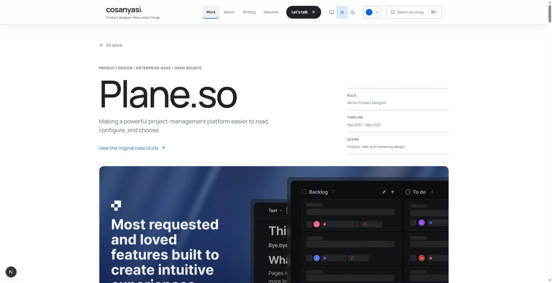
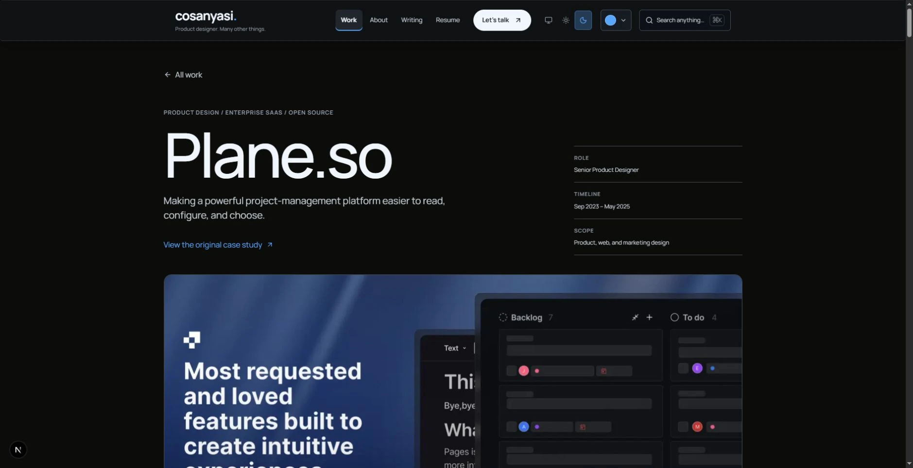
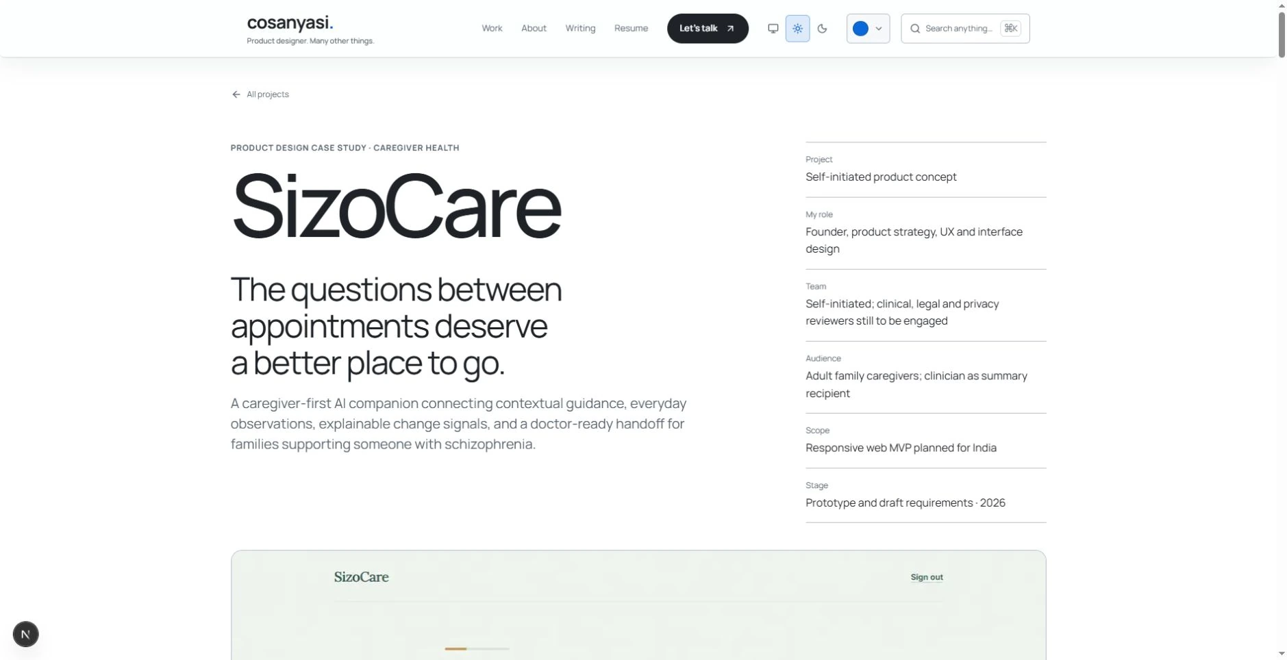
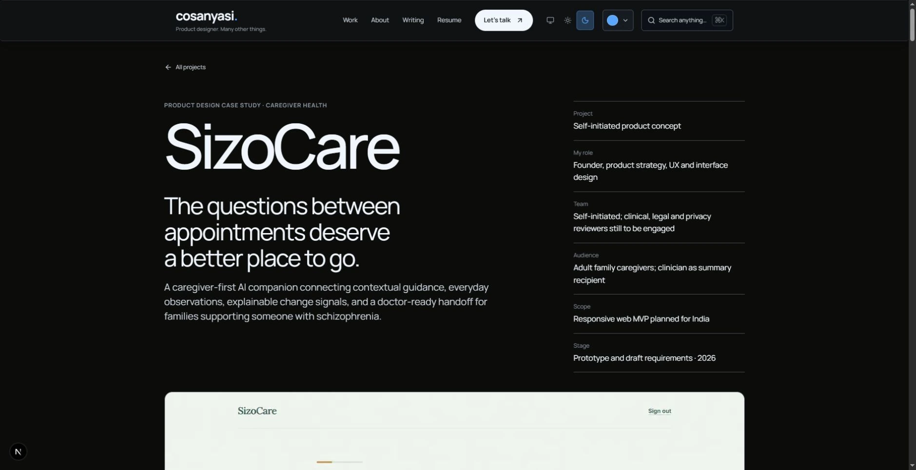
A shared template makes scanning easier. I know the benefit. Plane.so and SizoCare still have their own compositions, pacing, and ways of walking through the problem.
I chose that because an enterprise product story and a caregiver story need different space. The role, context, decisions, and evidence still have to be findable. Within that, I wanted each story to have a shape that belonged to it.
16. Even the website got a backstory.
Rule broken: Keep the portfolio itself out of the way of the portfolio work.
There is a colophon, a changelog, and an RSS feed. Even the website has its own paper trail.
And now there is an illustrated essay explaining why all of that exists. I know the joke. I wrote the extra page.
A smaller portfolio would be easier to review and easier to maintain. I know how to make that choice when the brief calls for it. Here, I chose to build a place I would want to keep using after the job search. These extras are staying. Medal worn.
If you came for the projects, here they are. If you came to talk, here is the door. If you came to make the lava purple, you already know how.